
Almost Maine
Dixie State College of Utah - Fall 2009
Black Box Theater
Director - Varlo Davenport
Dixie State College of Utah - Fall 2009
Black Box Theater
Director - Varlo Davenport
Almost Maine, by John Cariani is a wonderful heartfelt play about extraordinary tales of love taking place in the unsuspecting town of Almost, Maine. The premise of the play is all of these stories take place across the town at the stroke of 9:00 as the aurora borealis illuminates the cold, slightly surreal, northern night.
In order to achieve all the scenic and environmental demands of the play, I chose five major design goals.
In order to achieve all the scenic and environmental demands of the play, I chose five major design goals.
· Make it cold
· Create an illusion of depth and expanse
· Make it surreal
· Make it everything, and nothing
· Unify time, space, and location
The key element in achieving the goal of making the set cold was color palate. I used an online color palate generator to analyze photographs mentioned by Cariani in his notes.
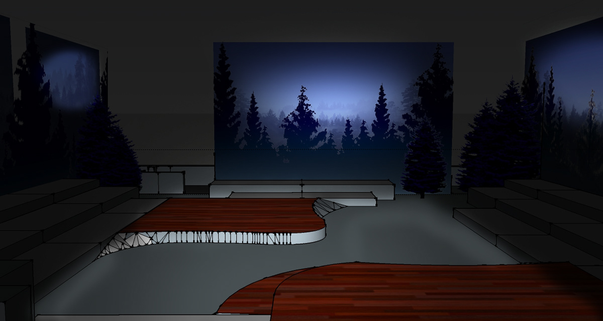
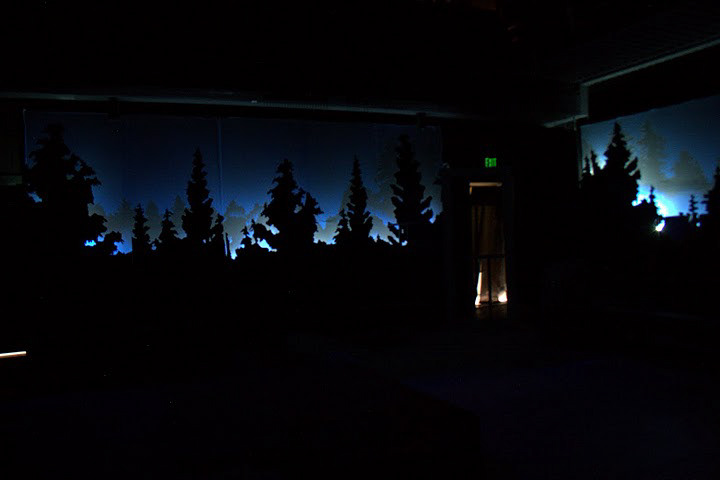
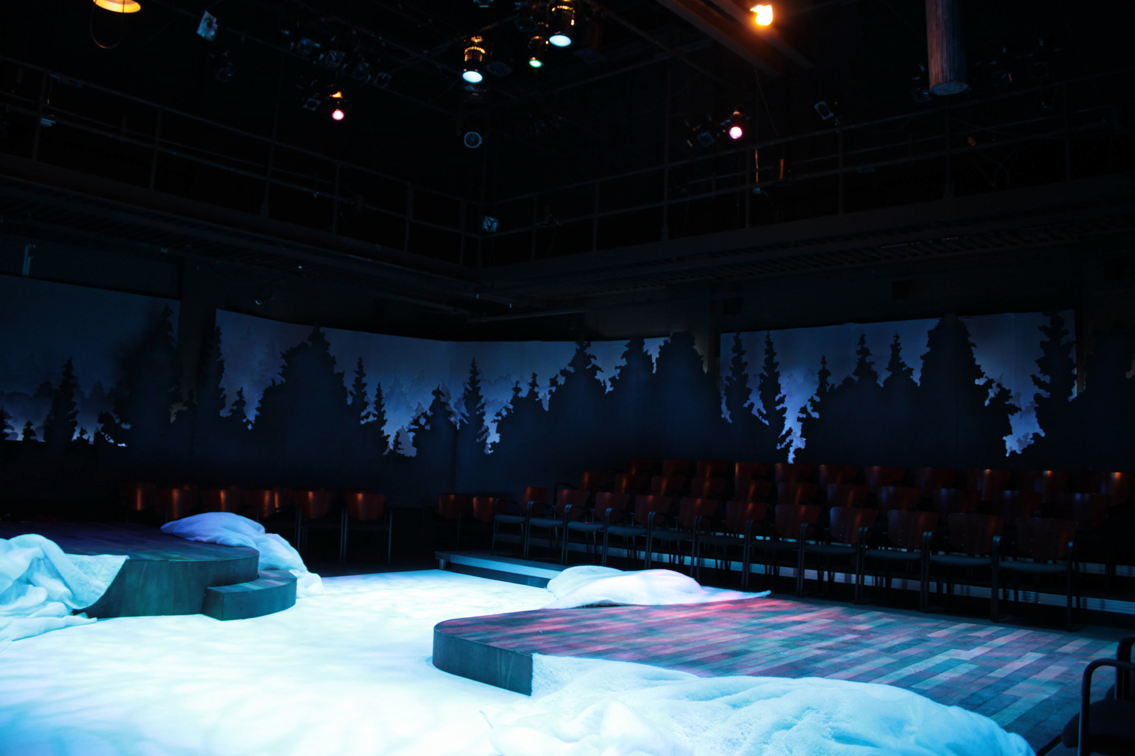
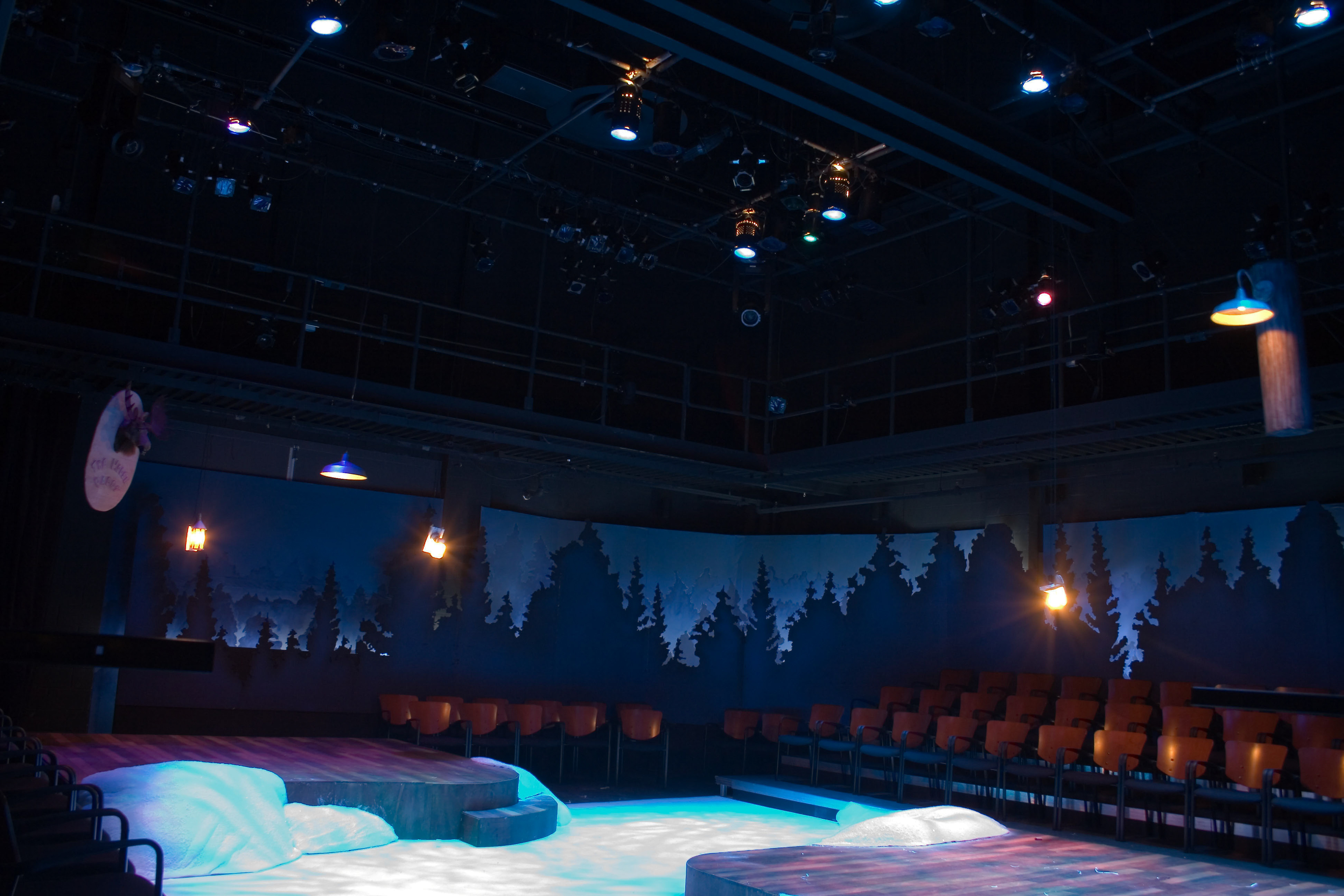
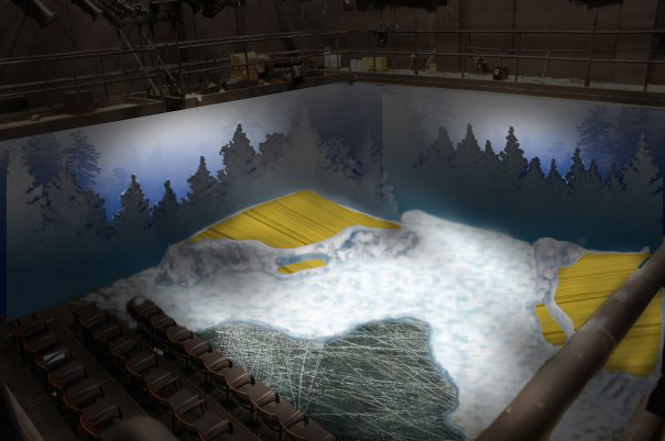
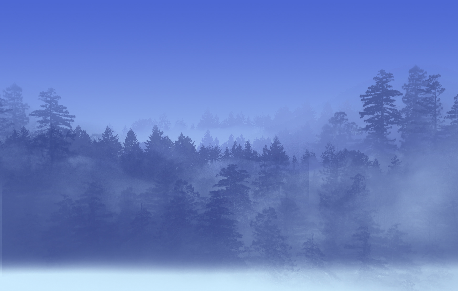
The idea of the expanse sea of love, paradoxically reflective of both abundance and lack of love, was an important theme in the script. I also felt that it was an idea that the audience could strongly relate and connect to. Who has experienced being lost in the unknown expanse of love at one point or another. In order to help create the feeling of an expanse, I decided to create an illusion of depth by making a wrap around drop that surrounded the audience. In front of this wrap around drop there was also a parameter of tree silhouettes to assist the depth illusion and also give a feeling of cozy isolation - much like what I imagine the town of Almost, Maine would feel like.
For the goal of making the location surreal, I drew inspiration from the suspended animation images of Salvador Dali and Philip Halsman. The reason I chose these suspended surrealism images was because they mirrored the sense of suspended time and the dramatic suspense that Cariani creates in the play. In the design, the look of surreal suspension was achieved by having all of the lights and set pieces that flew in lowered at the top of the show, and then used in their appropriate scenes. This design choice also helped support the theme of things being "almost." Cariani notes that the town of Almost is called Almost because it’s not quite a town; it’s an unorganized territory so at best it could only be almost a town. Each love story is also almost finished. They never quite resolve but instead end in a state of almost completion.
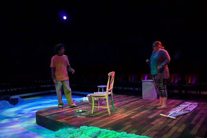
To make the set everything and nothing, I mean I needed to design a set that could be very neutral to provide many locations, but at the same time be more than a blank slate on stage. The reason I chose to have the elevated wood platforms and snow banks was they could easily go from interior to exterior looks with a change in light. The wood floors, when lit, had warmth to help create an indoor feel, but could also feasibly be an exterior porch.
The neutrality of the platforms also allowed for the unification of time space and location. Another aspect that I felt unified time, space and location, was the all the set pieces, such as door frames and chairs, were white washed. This not only gave everything a frosted look, but it helped unify the different spaces (again important because of the fact that all of these stories are taking place at the same time) and, at the same time, give each space its own personality.
The idea of the expanse sea of love, paradoxically reflective of both abundance and lack of love, was an important theme in the script. I also felt that it was an idea that the audience could strongly relate and connect to. Who has experienced being lost in the unknown expanse of love at one point or another. In order to help create the feeling of an expanse, I decided to create an illusion of depth by making a wrap around drop that surrounded the audience. In front of this wrap around drop there was also a parameter of tree silhouettes to assist the depth illusion and also give a feeling of cozy isolation - much like what I imagine the town of Almost, Maine would feel like.
For the goal of making the location surreal, I drew inspiration from the suspended animation images of Salvador Dali and Philip Halsman. The reason I chose these suspended surrealism images was because they mirrored the sense of suspended time and the dramatic suspense that Cariani creates in the play. In the design, the look of surreal suspension was achieved by having all of the lights and set pieces that flew in lowered at the top of the show, and then used in their appropriate scenes. This design choice also helped support the theme of things being "almost." Cariani notes that the town of Almost is called Almost because it’s not quite a town; it’s an unorganized territory so at best it could only be almost a town. Each love story is also almost finished. They never quite resolve but instead end in a state of almost completion.
To make the set everything and nothing, I mean I needed to design a set that could be very neutral to provide many locations, but at the same time be more than a blank slate on stage. The reason I chose to have the elevated wood platforms and snow banks was they could easily go from interior to exterior looks with a change in light. The wood floors, when lit, had warmth to help create an indoor feel, but could also feasibly be an exterior porch.
The neutrality of the platforms also allowed for the unification of time space and location. Another aspect that I felt unified time, space and location, was the all the set pieces, such as door frames and chairs, were white washed. This not only gave everything a frosted look, but it helped unify the different spaces (again important because of the fact that all of these stories are taking place at the same time) and, at the same time, give each space its own personality.
Photoshop light rendering of the completed look with the wrap around drop and silhouettes combined. The central light , the vignetted look, the framing of the tree silhouettes, and the atmospheric perspective of the drop, help create a "tunnel" which leads the eye outward.
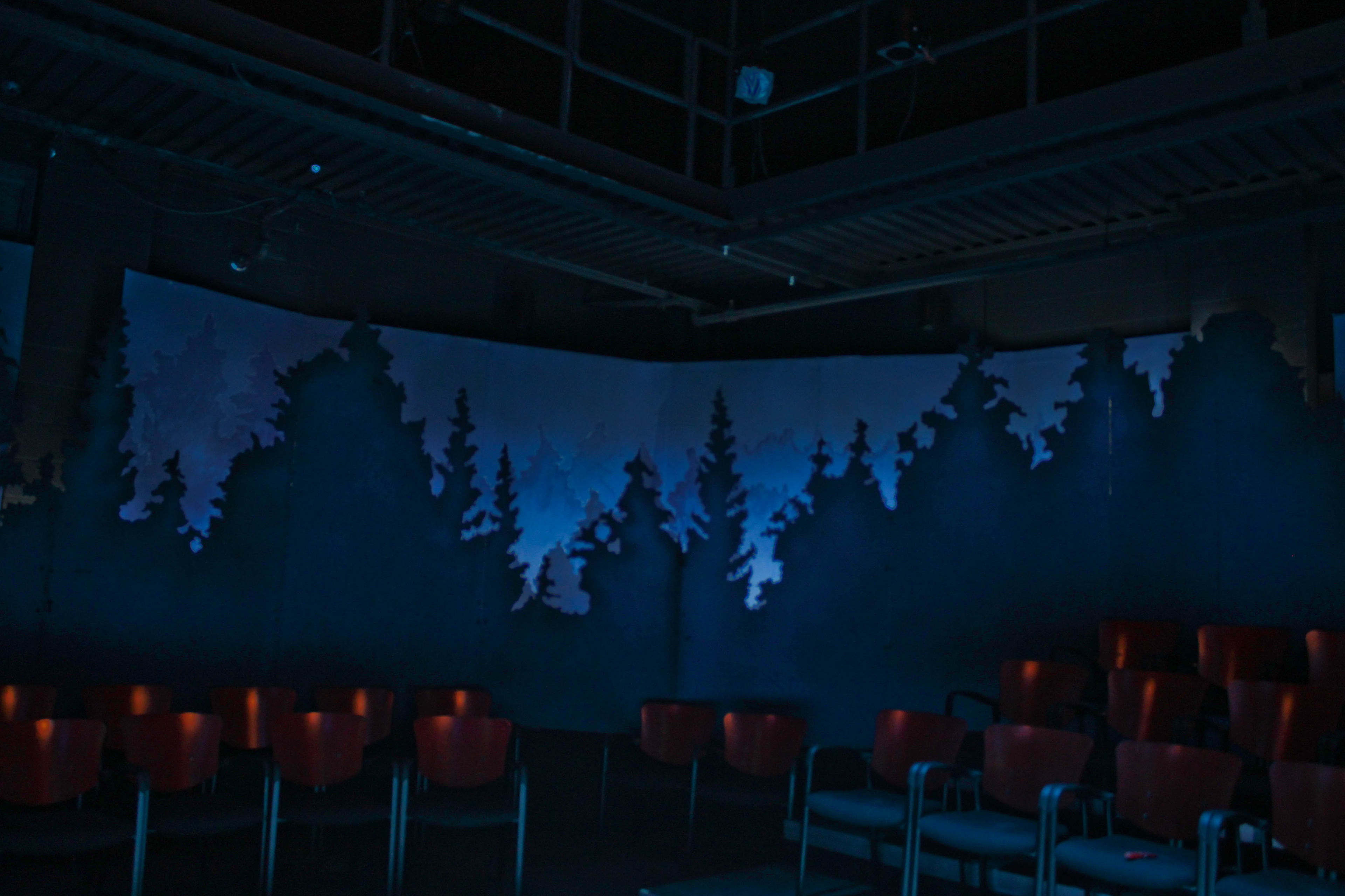
Finished wrap around silhouettes and drop. When the lights for scenes were up, the backdrop lights were comparatively weak; thus keeping focus on the scene happening on stage.
However, during scene changes the stage lights would dim and the drop lights would appear brighter. During the scene changes the audience would become aware of the depth and the expanse. I feel it served as a useful transitional story element and a unifying moment between scenes.
Completed set showing one half of the wrap around drops and silhouettes.
Pre-show look with all of the lights from different scenes lowered in and the look inspired by the suspended surrealist art of Dali and Halsman.
Opening scene with the aurora borealis effect.
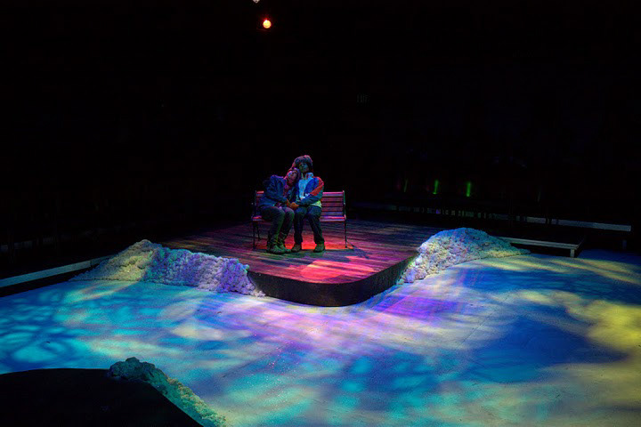
Production photo of Story of Hope with its surreal suspended light.
Production photo of Sad and Glad
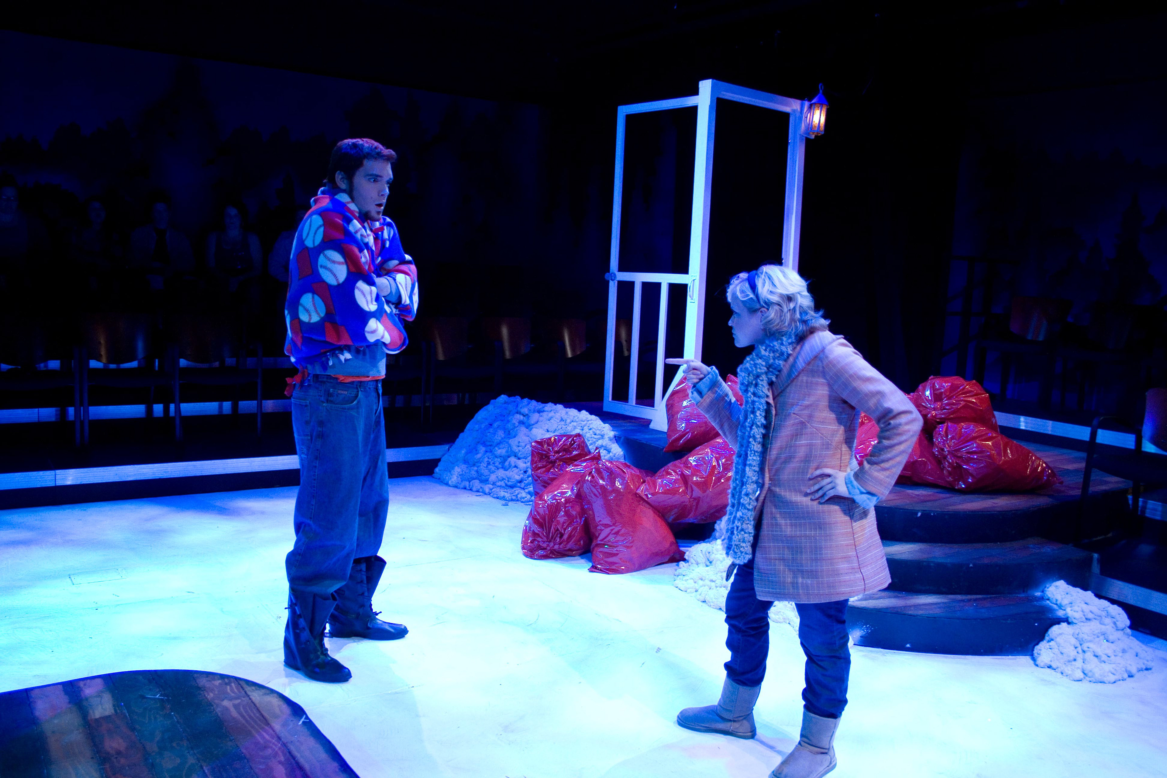
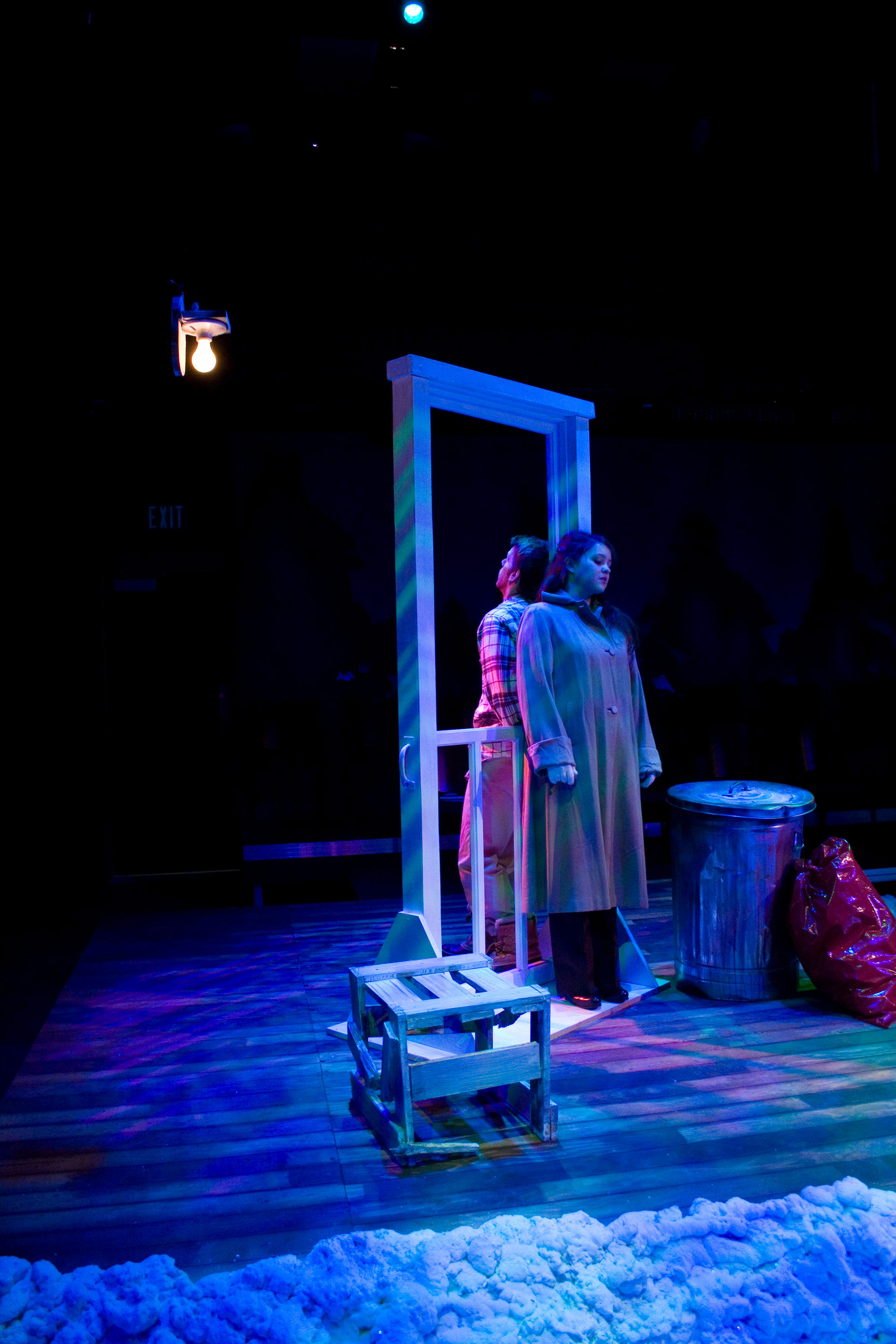
Production photo of Getting It Back. In each scene the director requested that an object that was symbolic of love in the scene be red. Sometimes it was a costume piece or a prop, but in some cases, like the scene pictured here and the scene, Story of Hope, it was a set piece or a piece of furniture.
Production photo of This Hurts
Initial concept sketch done in Photoshop
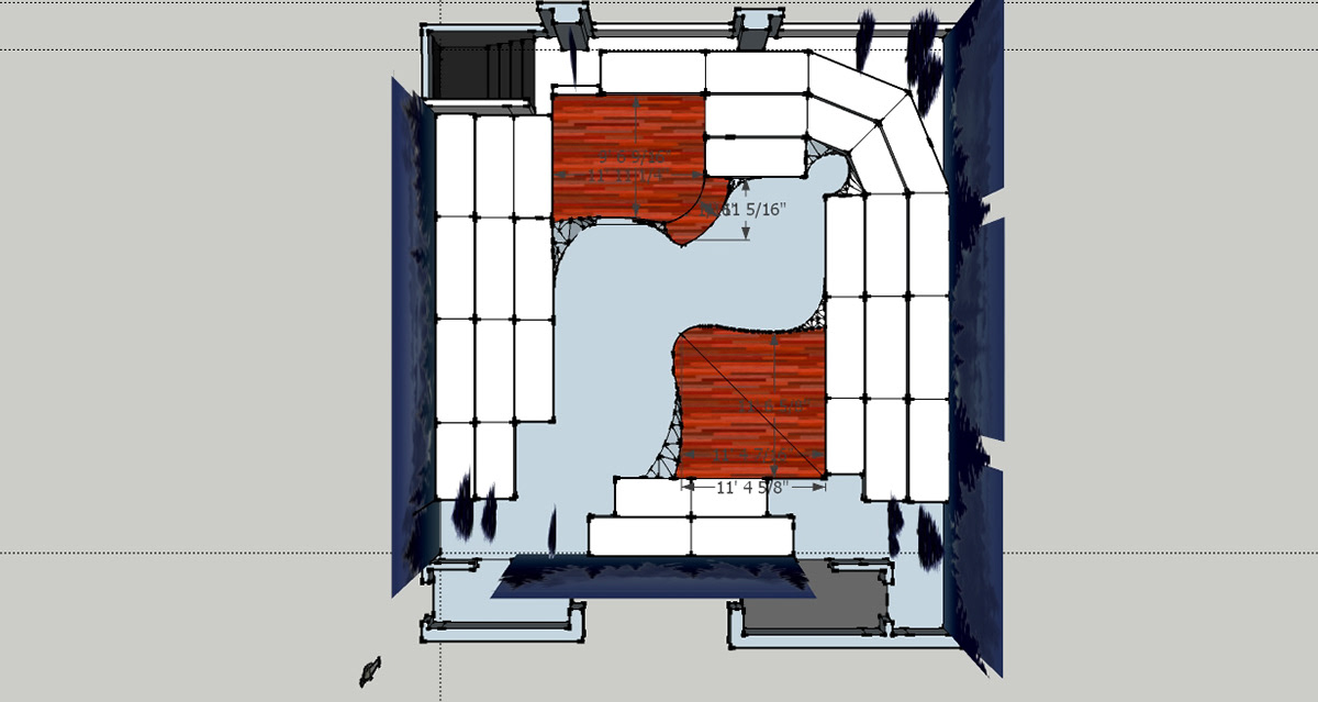
Sketchup ground plan

Paint elevation for wrap around tree silhouettes.
Paint elevation for a section of the wrap around drop.